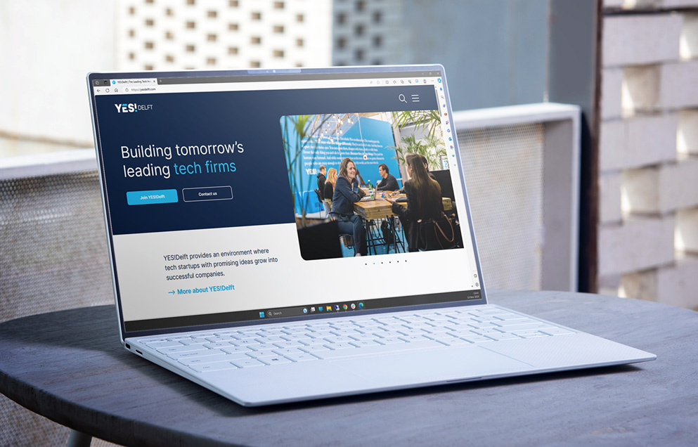
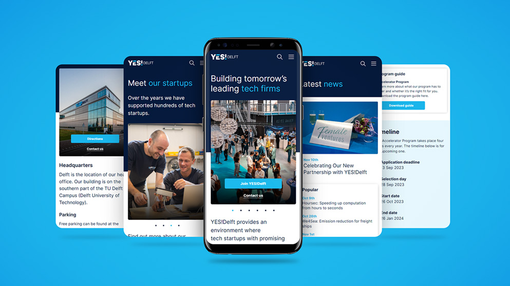
For YES!Delft, one of the top five university incubators in the world, we recently had the privilege of developing and launching the new website. Together with the back office - that we made as part of the website, the intranet and the socials, this website for the tech incubator of the Delft University (TU Delft) forms YES!Delft's digital hub in their ecosystem of startups, partners and investors.
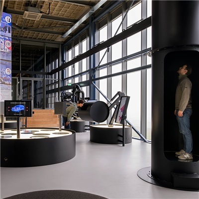
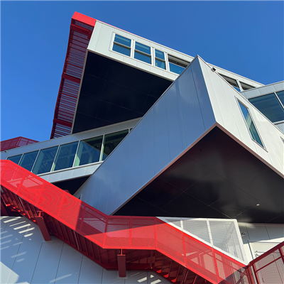
Anyone who visits TU Delft has probably seen it or been there: the transparent and shiny white headquarters of YES!Delft. This building, with the allure of inventiveness, technology and entrepreneurship, is the place where today's creative disruptors come together to work on the innovations of tomorrow. Young entrepreneurs are supported in this by the YES!Delft team, consisting of mentors, experts and experienced entrepreneurs.
In order to ensure that the website fits in well with the accessible and cooperative nature of both the headquarters and the organization itself, we created a design with ease of use as the main starting point and built a website where technology itselft is not dominantly present, but is working in the background to provide the snappy user experience that makes visiting a website a pleasant experience. Technology is important, especially for a tech incubator, but ultimately it is mainly a means to facilitate the processes of the organization and the proper functioning of the website for its visitors.
Since the founding of YES!Delft in 2005, the YES!Delft website had been rebuilt several times. An incubator and accelerator such as YES!Delft is continuously developing, and so is the website. However, it remained mainly a 'male hight tech' website, with too little attention to the customer journey and user experience for a target group that is broader than just techies. We wanted to do that differently. By starting with a preliminary investigation and a series of conversations with the YES!Delft brand and marketing team, we were able to work from a perfect insight into the organization and first created an intuitive navigation structure, followed by a fresh graphic design and thus ultimately a website that is well found, works pleasantly, intuitively and securely and is easy for YES!Delft to manage.
The website now offers a pleasant user experience and a platform where startups, students, partners, investors and mentors meet, can present themselves and stay informed. Above all, starting entrepreneurs can use the website to register for services, programs and events that YES!Delft organizes especially for them.
The new YES!Delft website can be visited at: yesdelft.com.
